Annual Color Portfolio
Color is what drives people to buy a product, but it also is what drives people from not buying a product. The power of color is a crucial step in the product development cycle. Having a great understanding of your consumer and color trends are important. I have developed annual color refreshes to established and well known product lines across different consumers and brands.

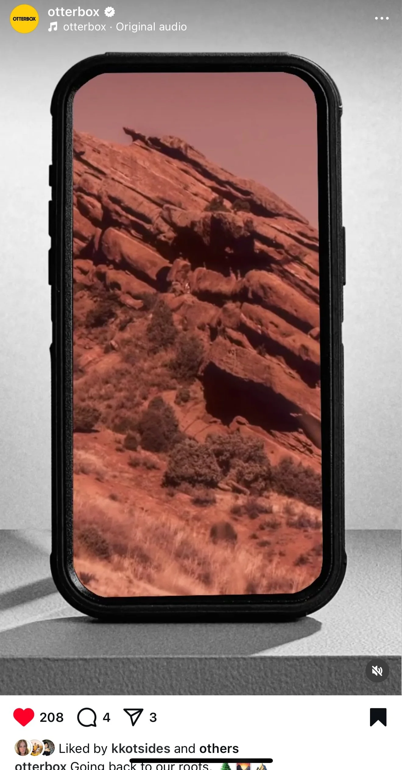
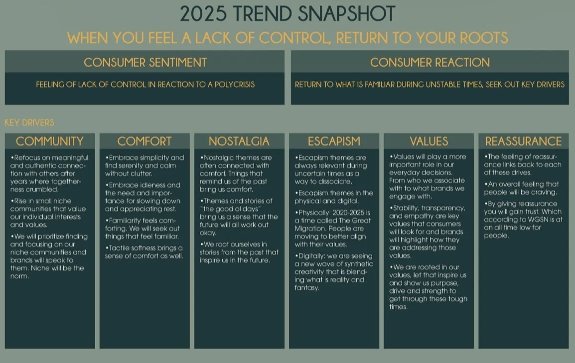
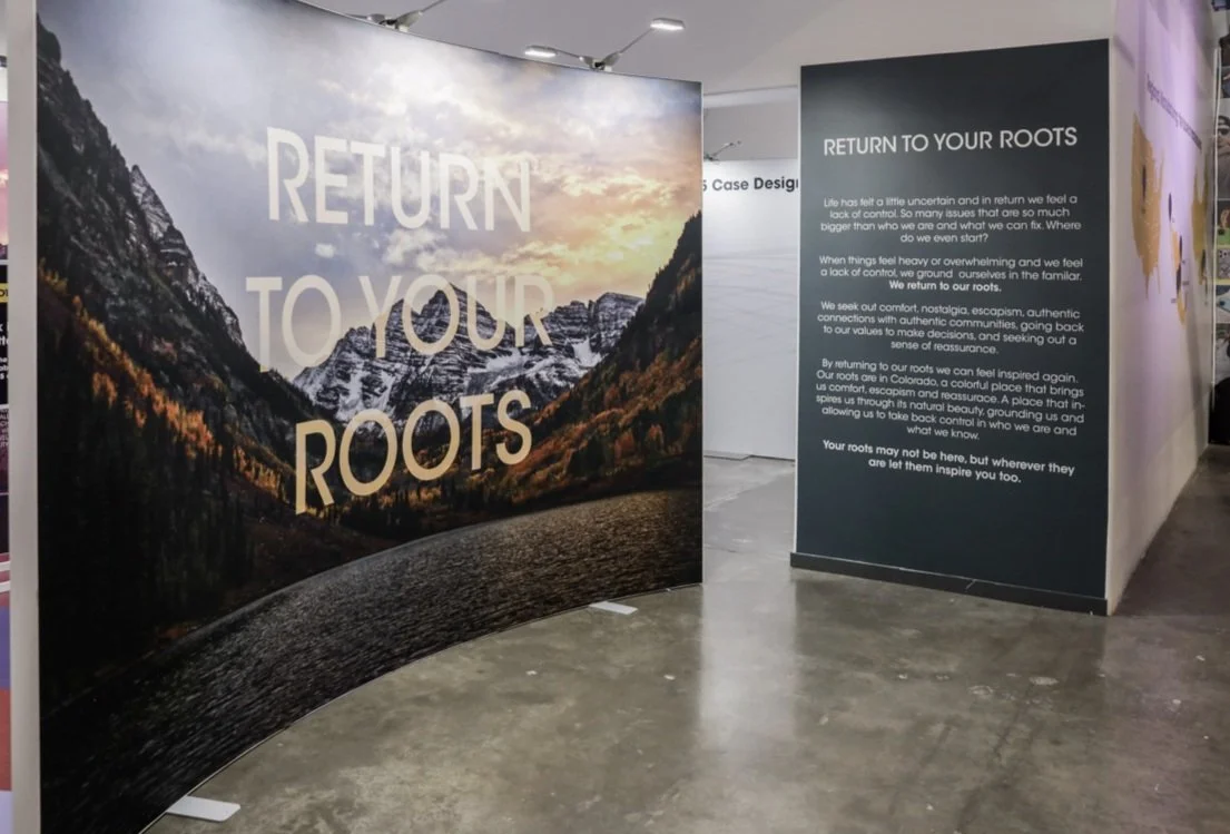
Return to your roots
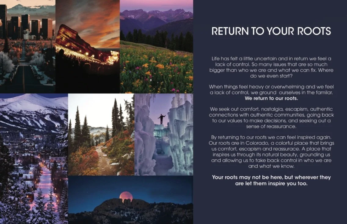
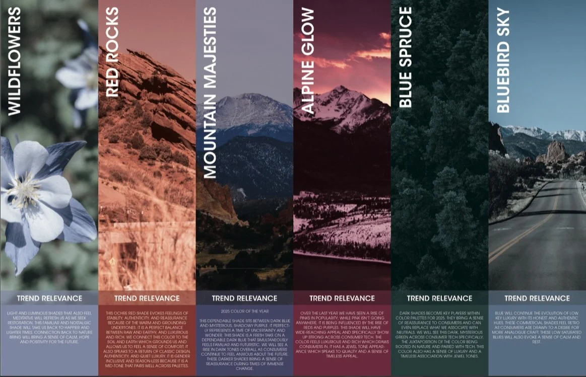
Every year I research what will drive trends forward and what is tying together all the big ideas. I start researching two years out and focus on what is happening in current areas of our lives and how might that shift our lives two years from now. I use the methodology of researching social, technology, environment, politics, industry, and creativity trends to uncover overarching themes and ideas. For 2025, the theme of uncertainty about the future kept coming up. While it seems our future will always be uncertain, I wanted to uncover how people will react to the uncertainty and what behaviors and ideas might shift. As I furthered my research I saw in uncertain times and feeling a lack of control, people turn back to what they know to ground themselves. That is where the idea of return to your roots came from for OtterBox’s 2025 annual trend story.
2025 Annual Trend Research
Every year I create a color palette that is based in trend research, aligns with OtterBox’s consumer segmentation, and relates back to the overall trend story. This color palette will then be applied to all product lines in different way. The new color palette launches each fall for the biggest launch.
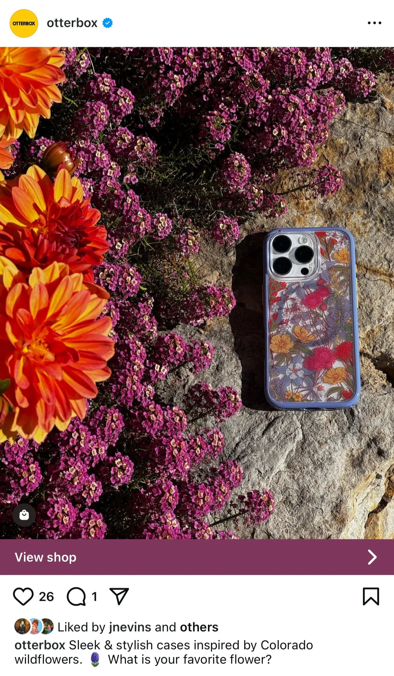
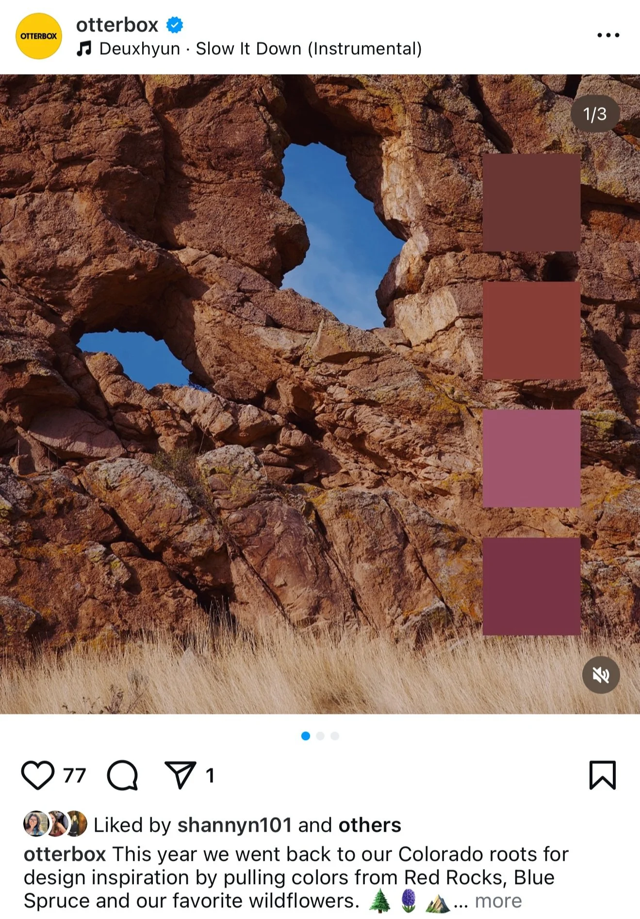
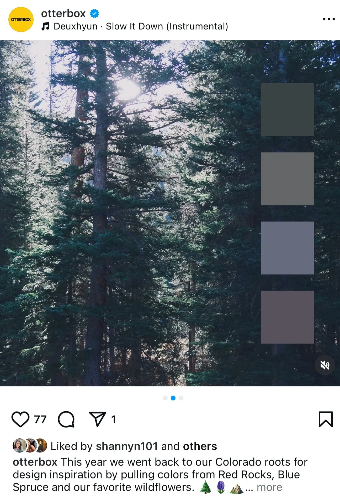
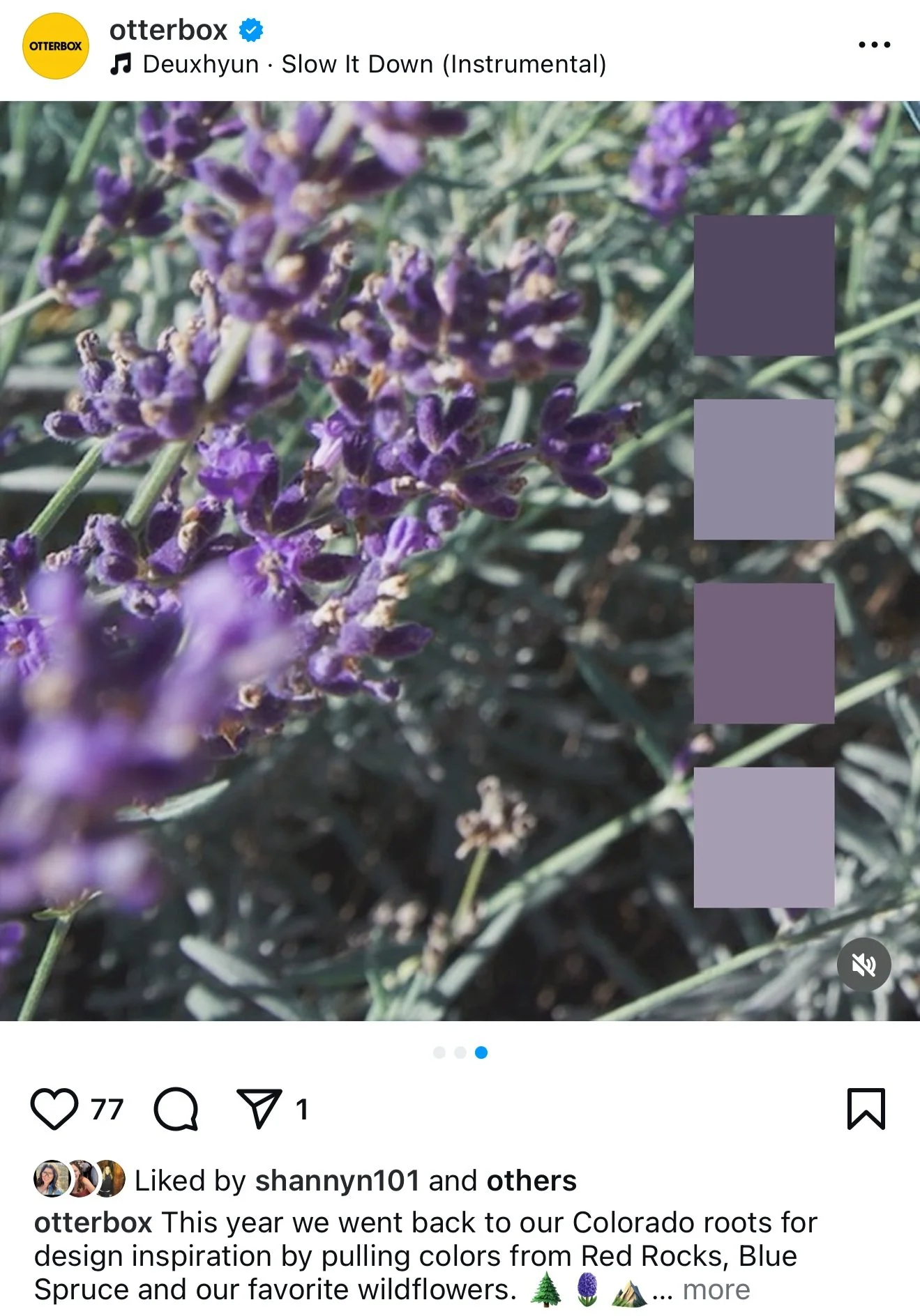
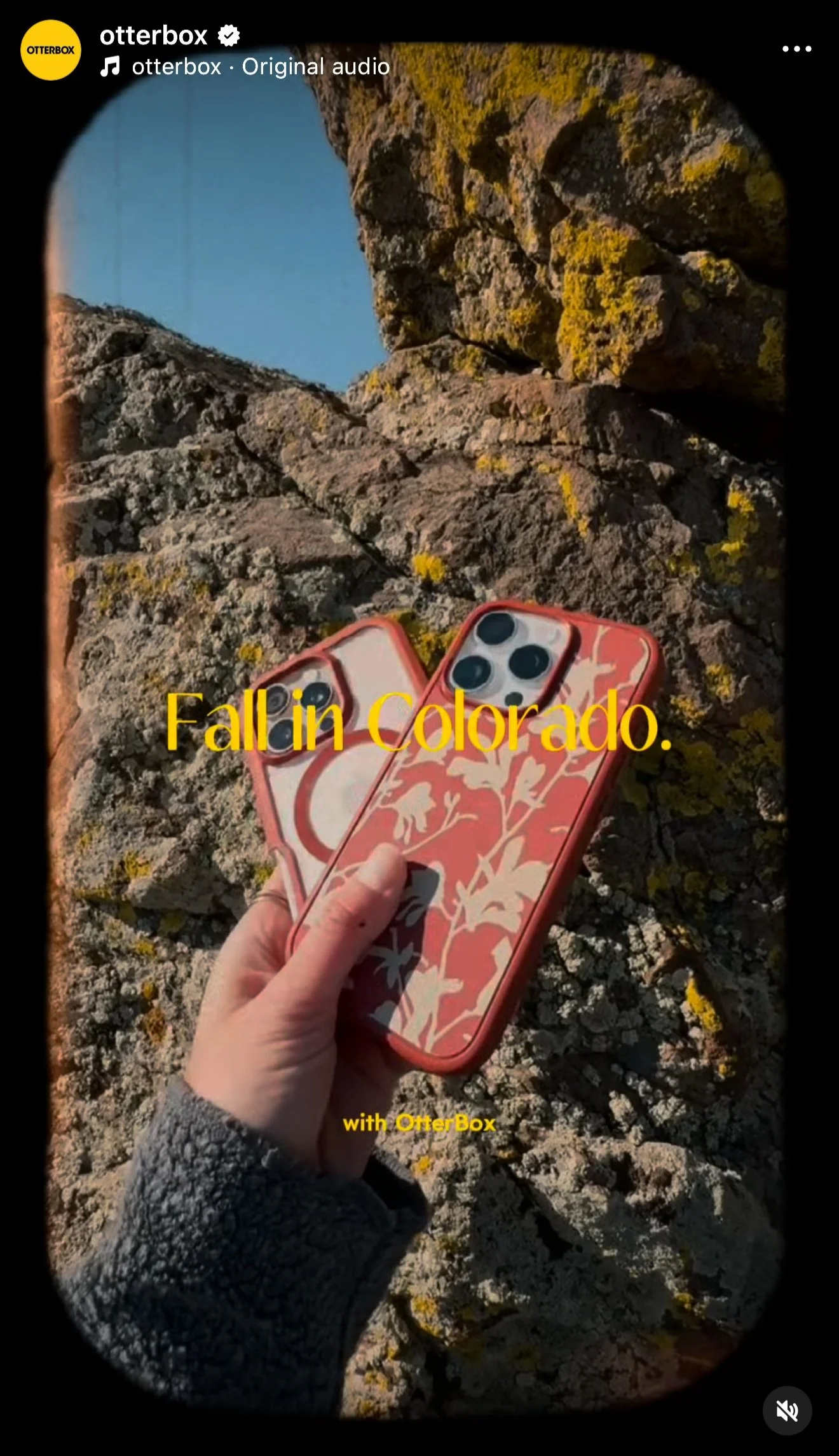
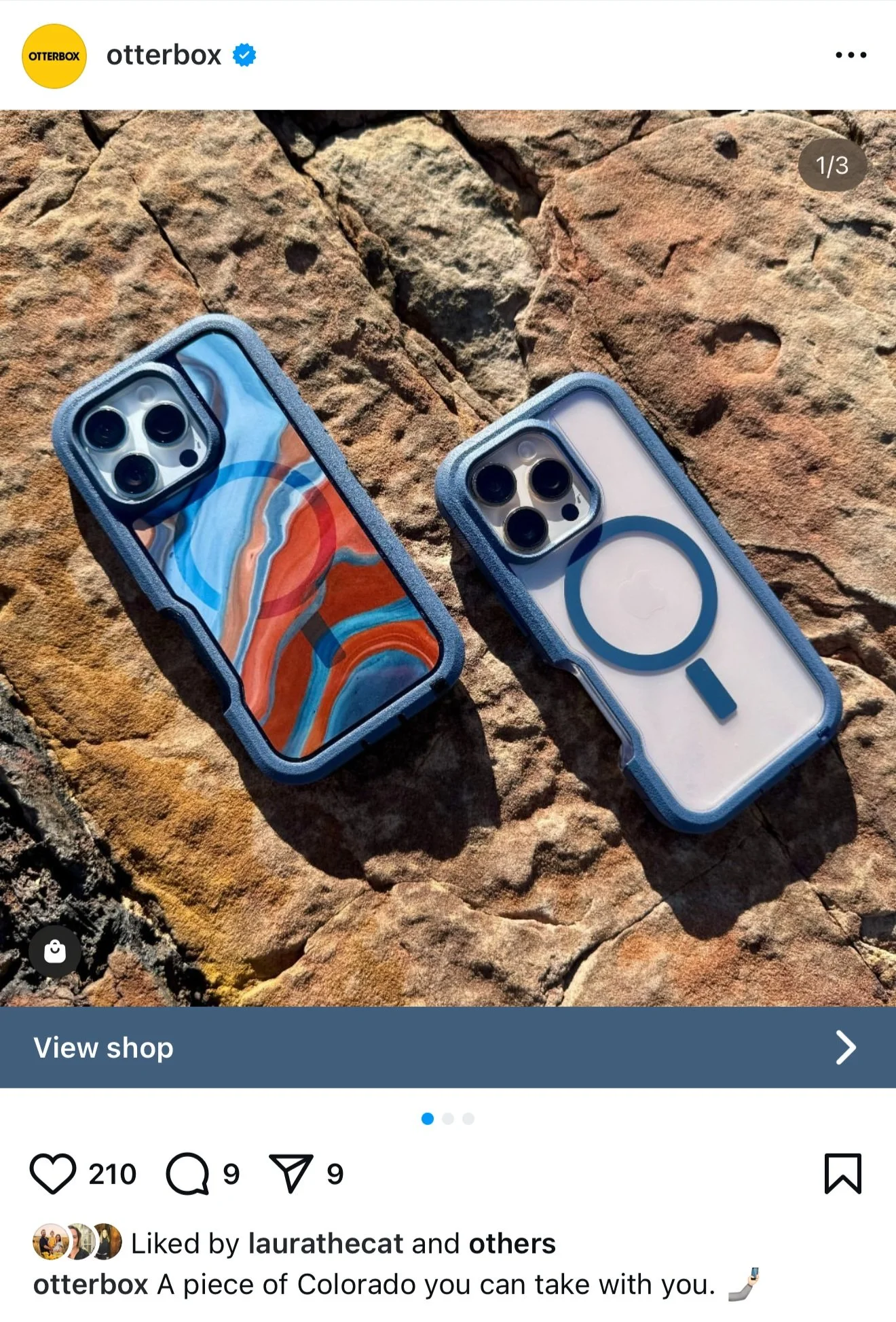
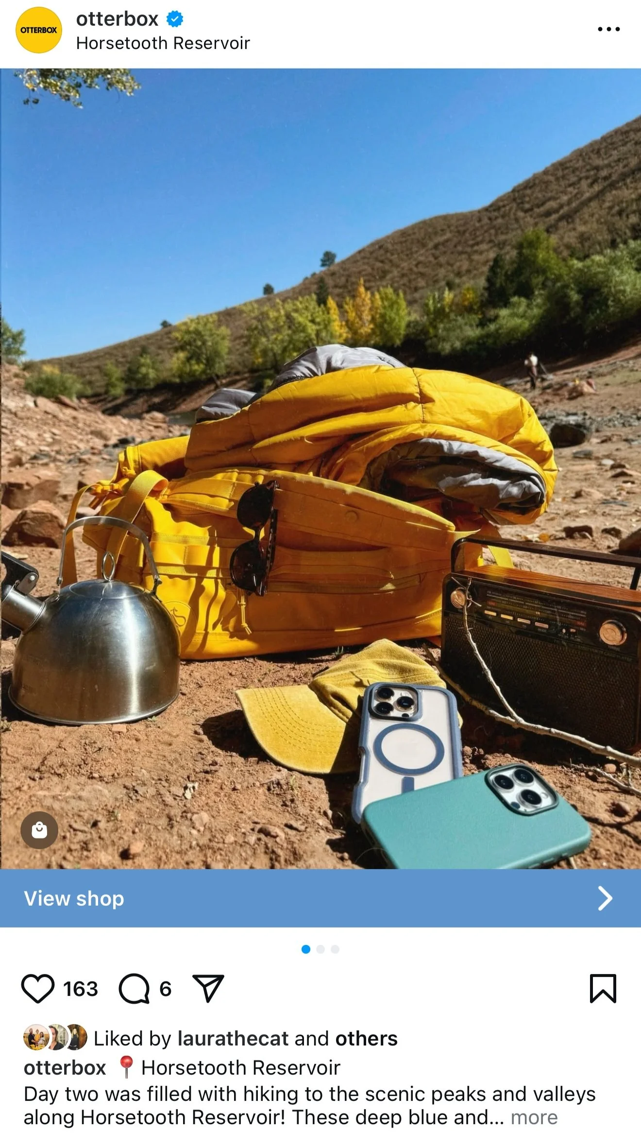
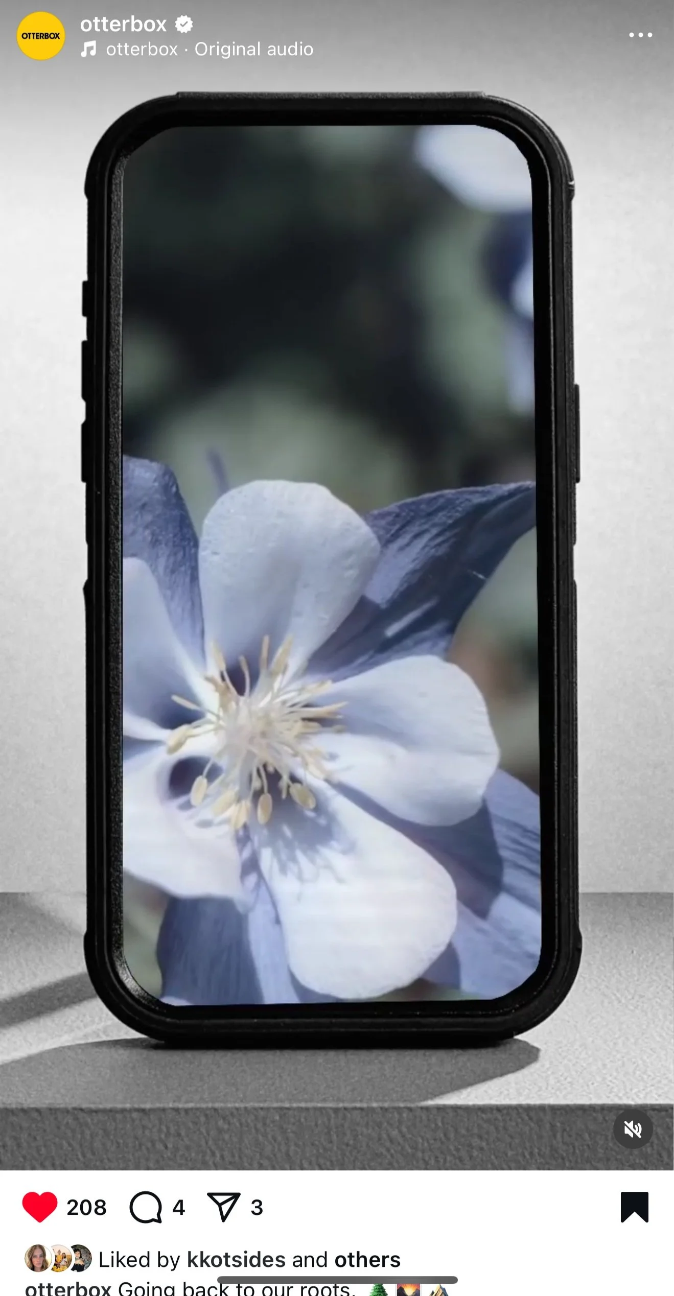
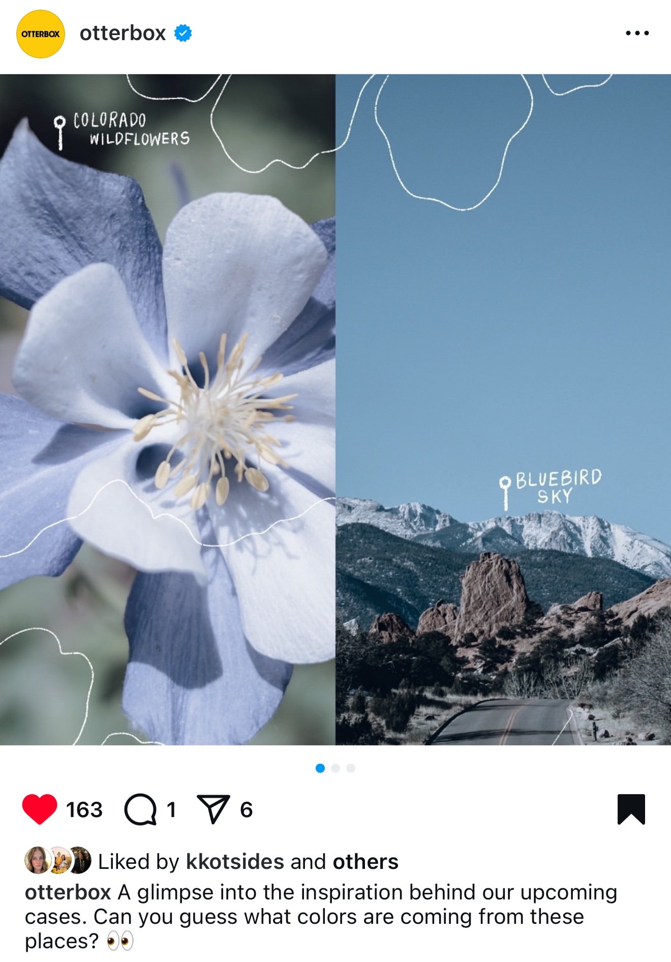
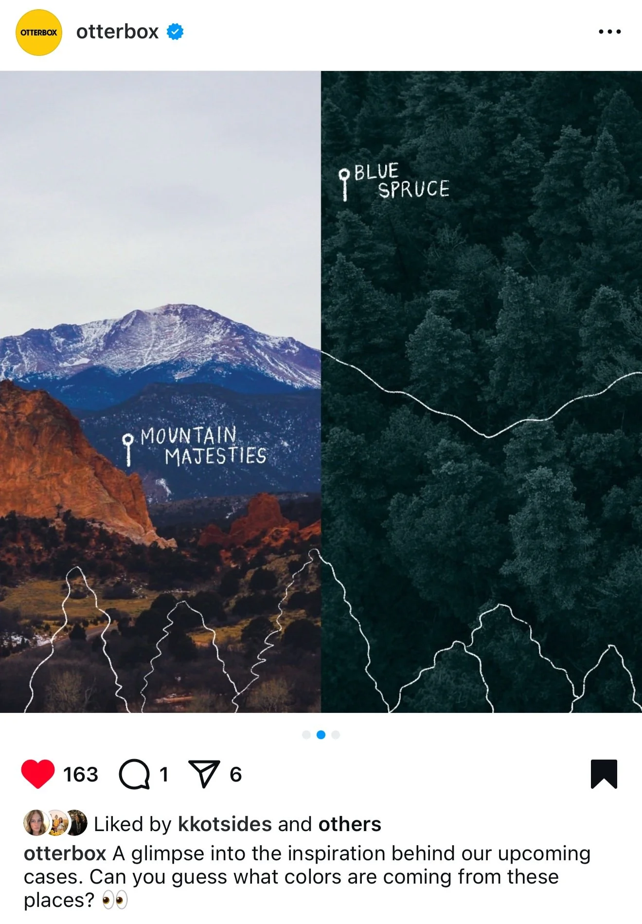
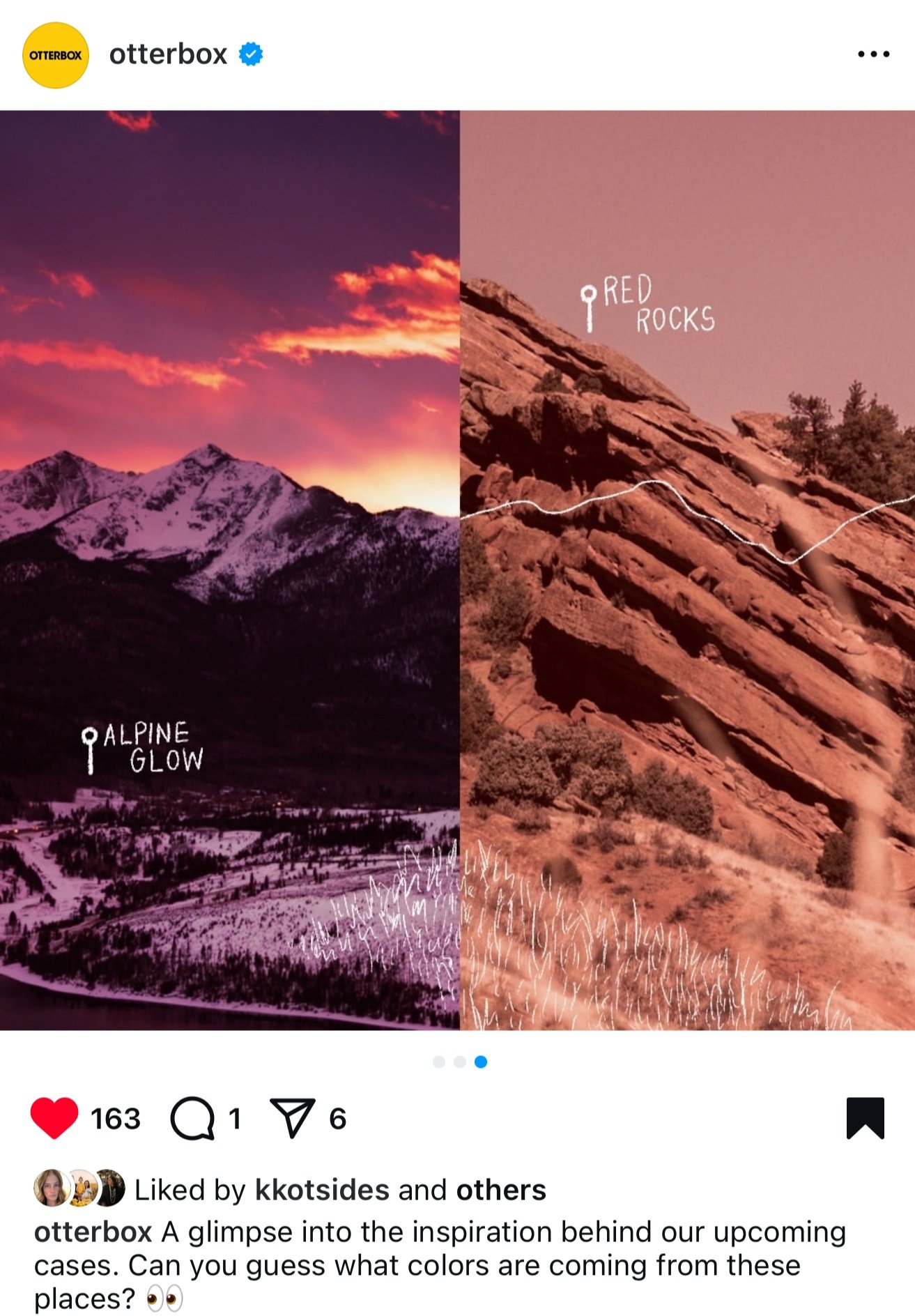
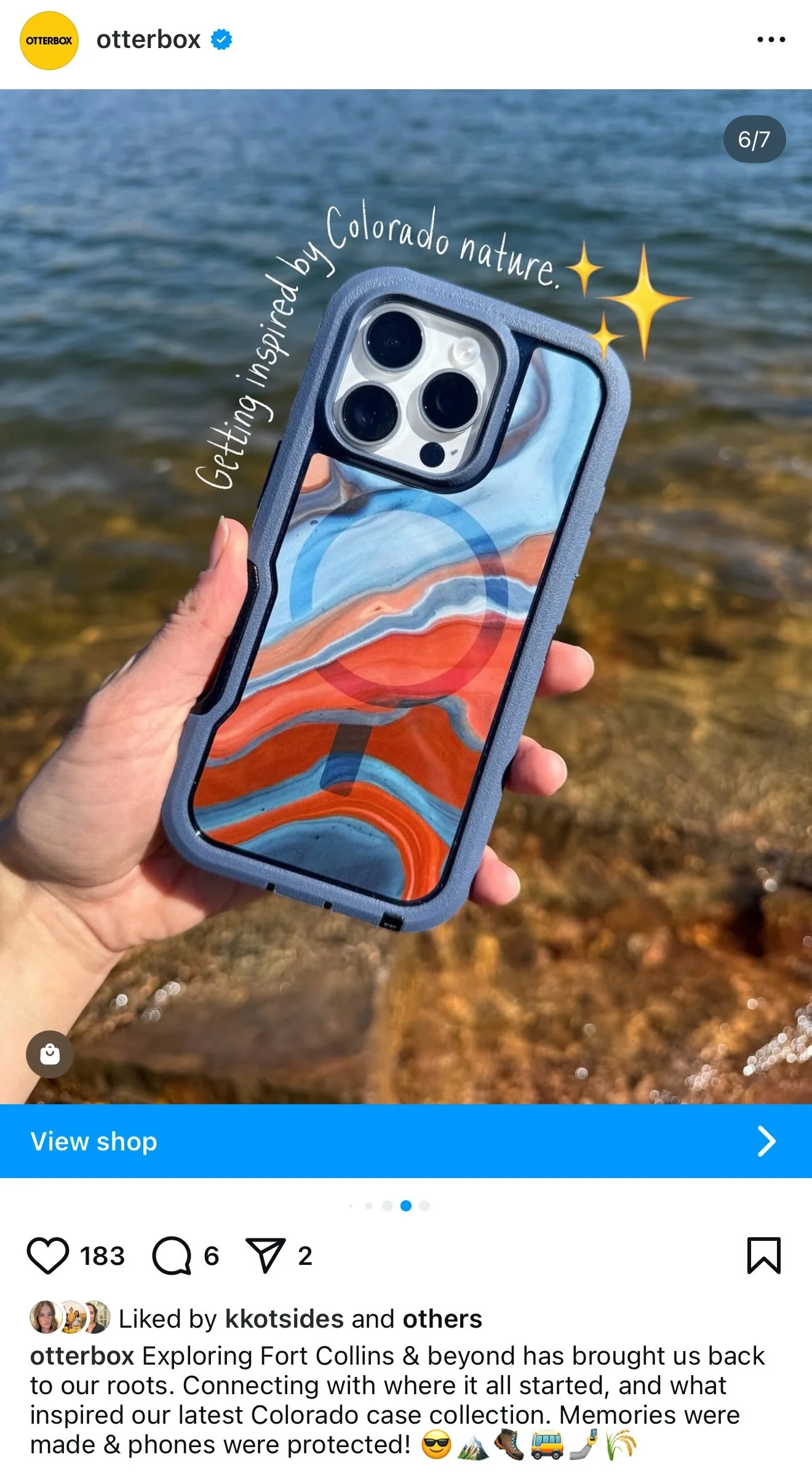
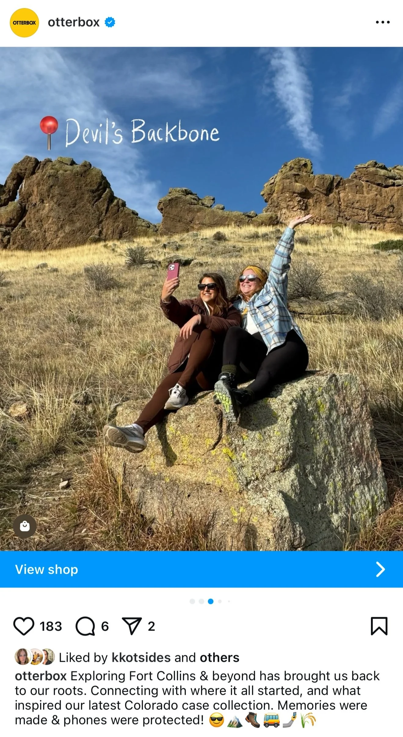
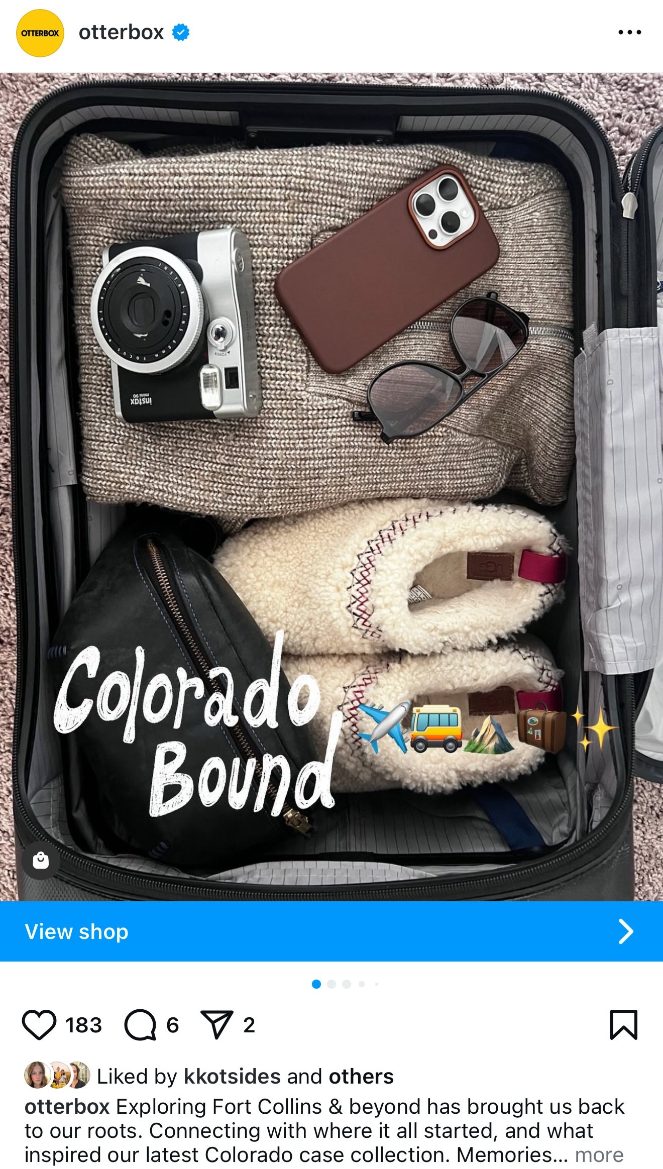
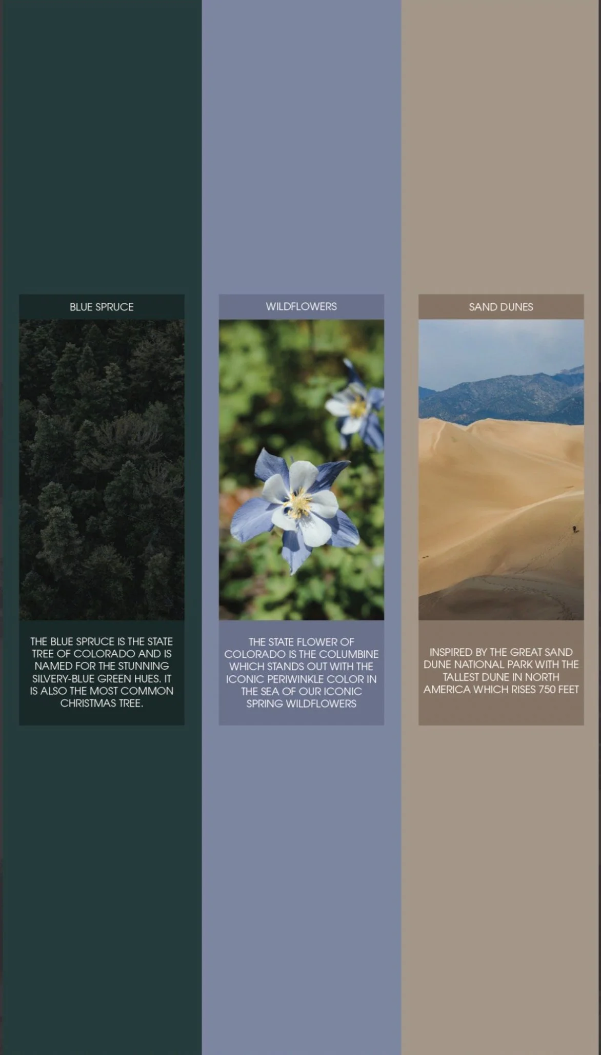
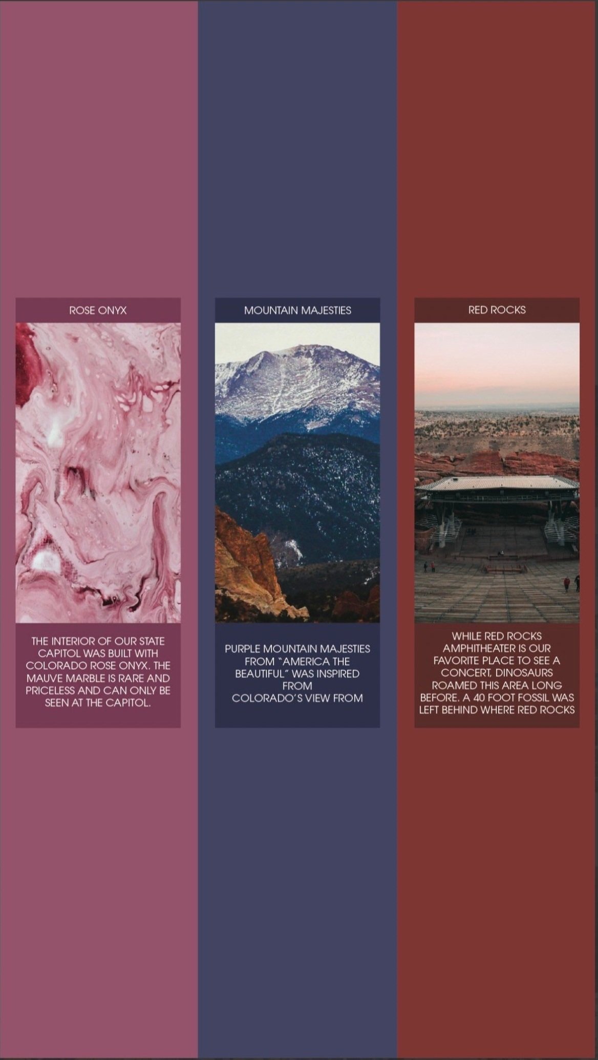
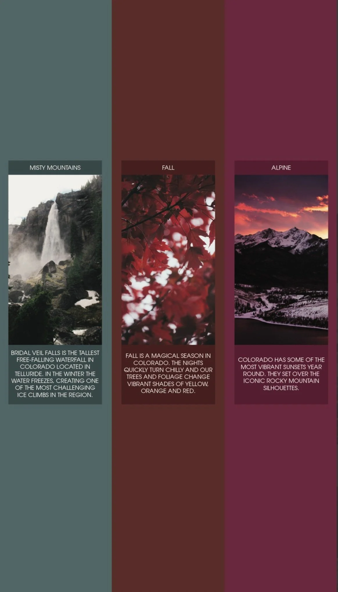
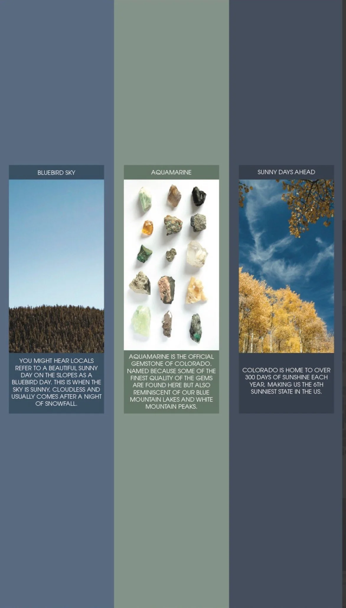
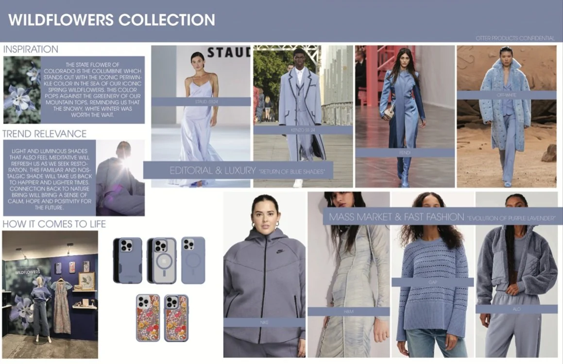
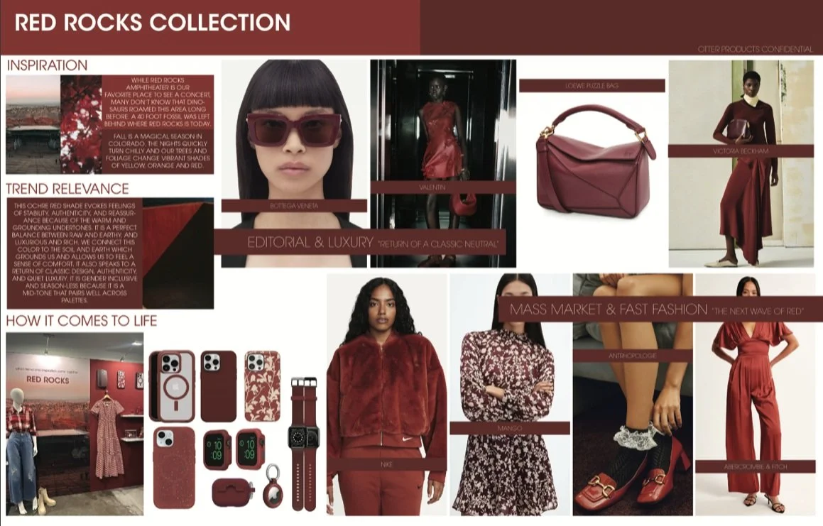
For Return to your roots, I drew inspiration from where OtterBox’s roots started and grew. OtterBox was created and has been based in Fort Collins, Colorado for the last 25 years. I drew color inspiration from the beautiful colorful Colorado and the places and things that make this place so special.
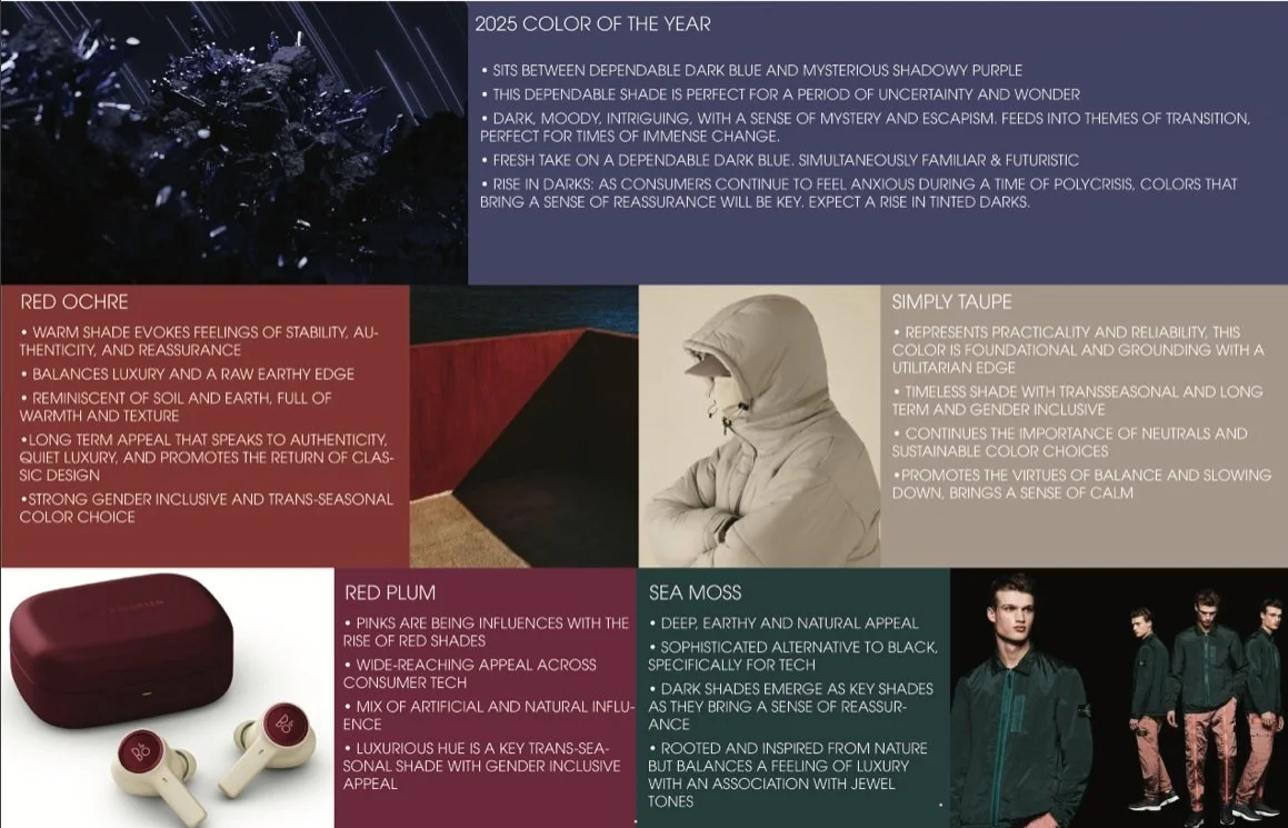
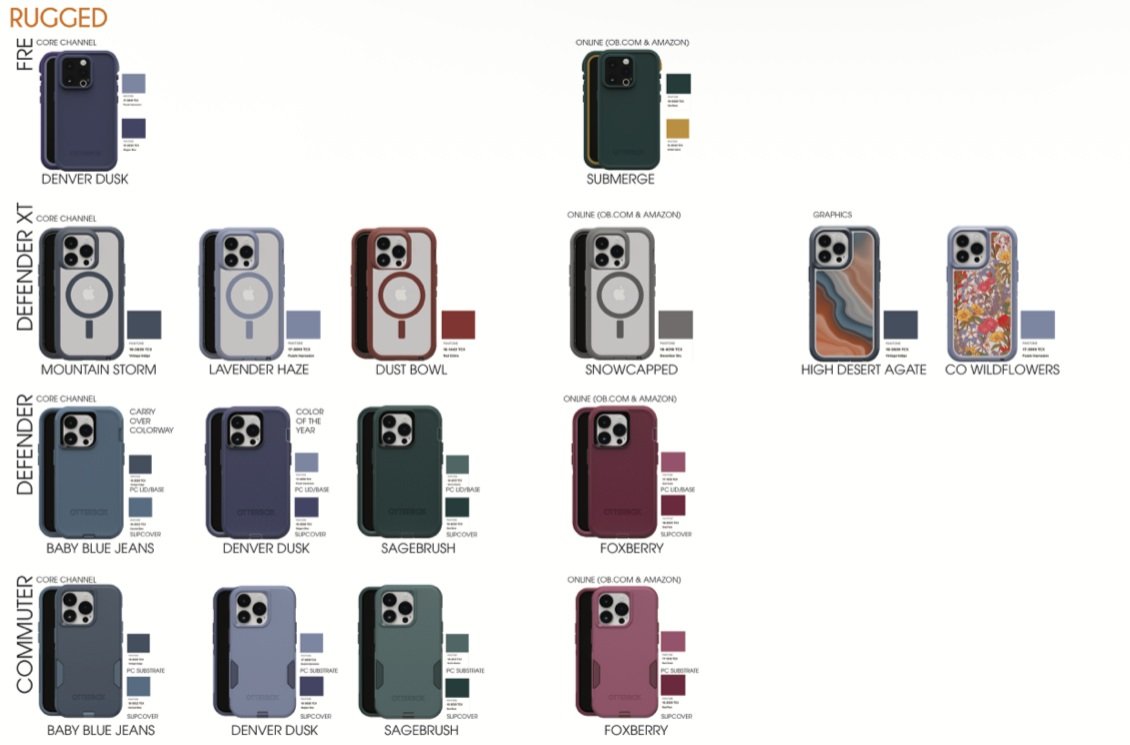
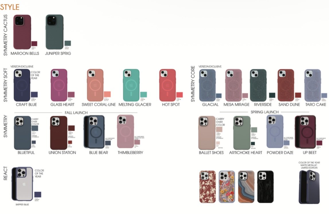
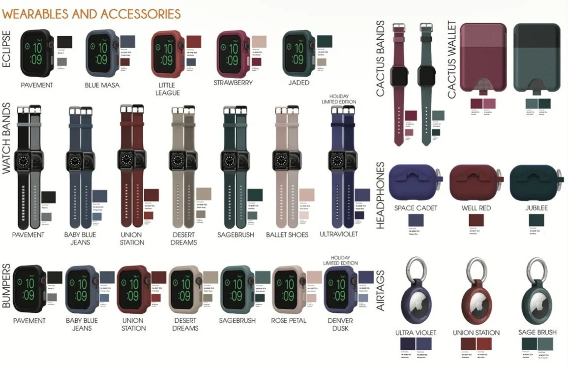
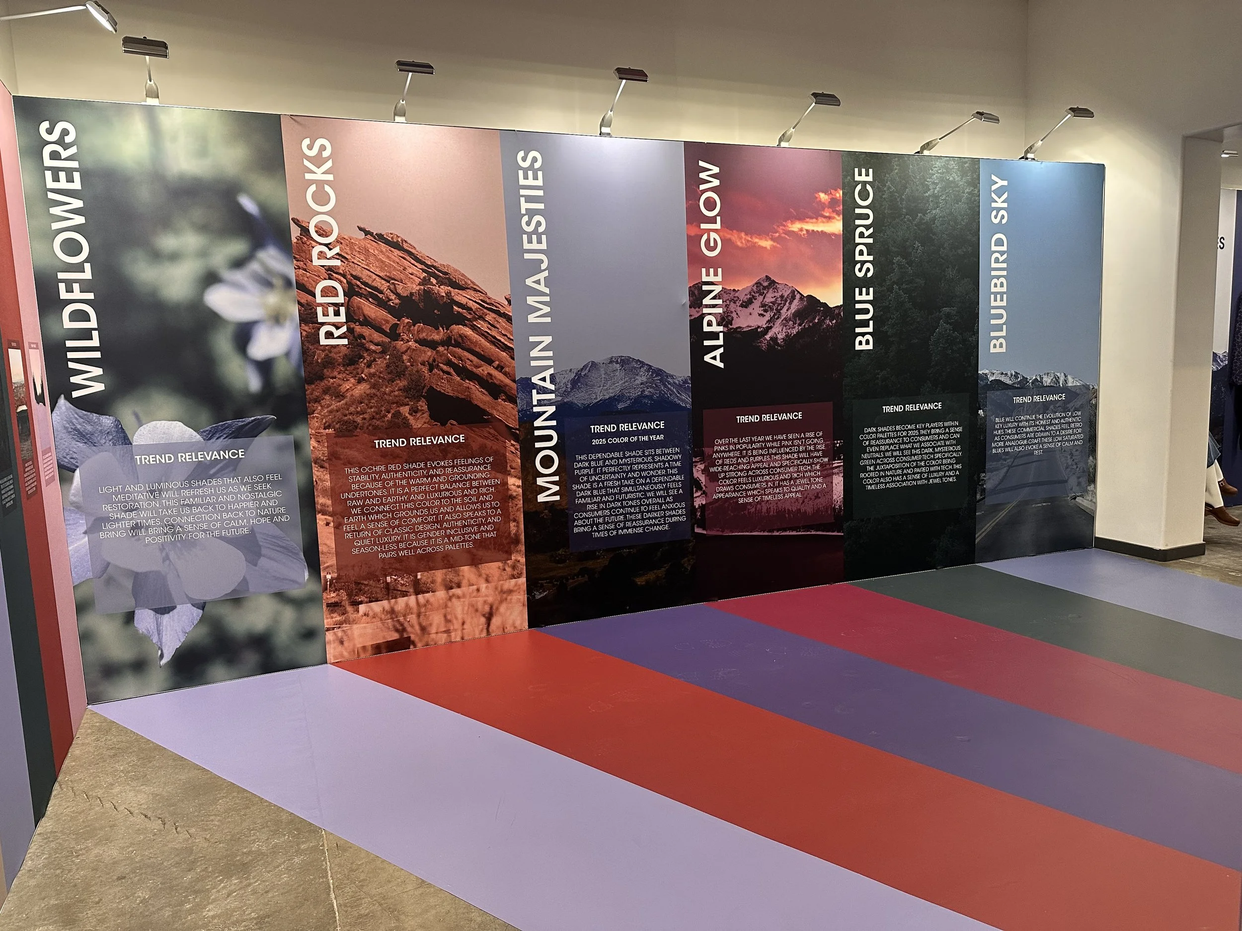
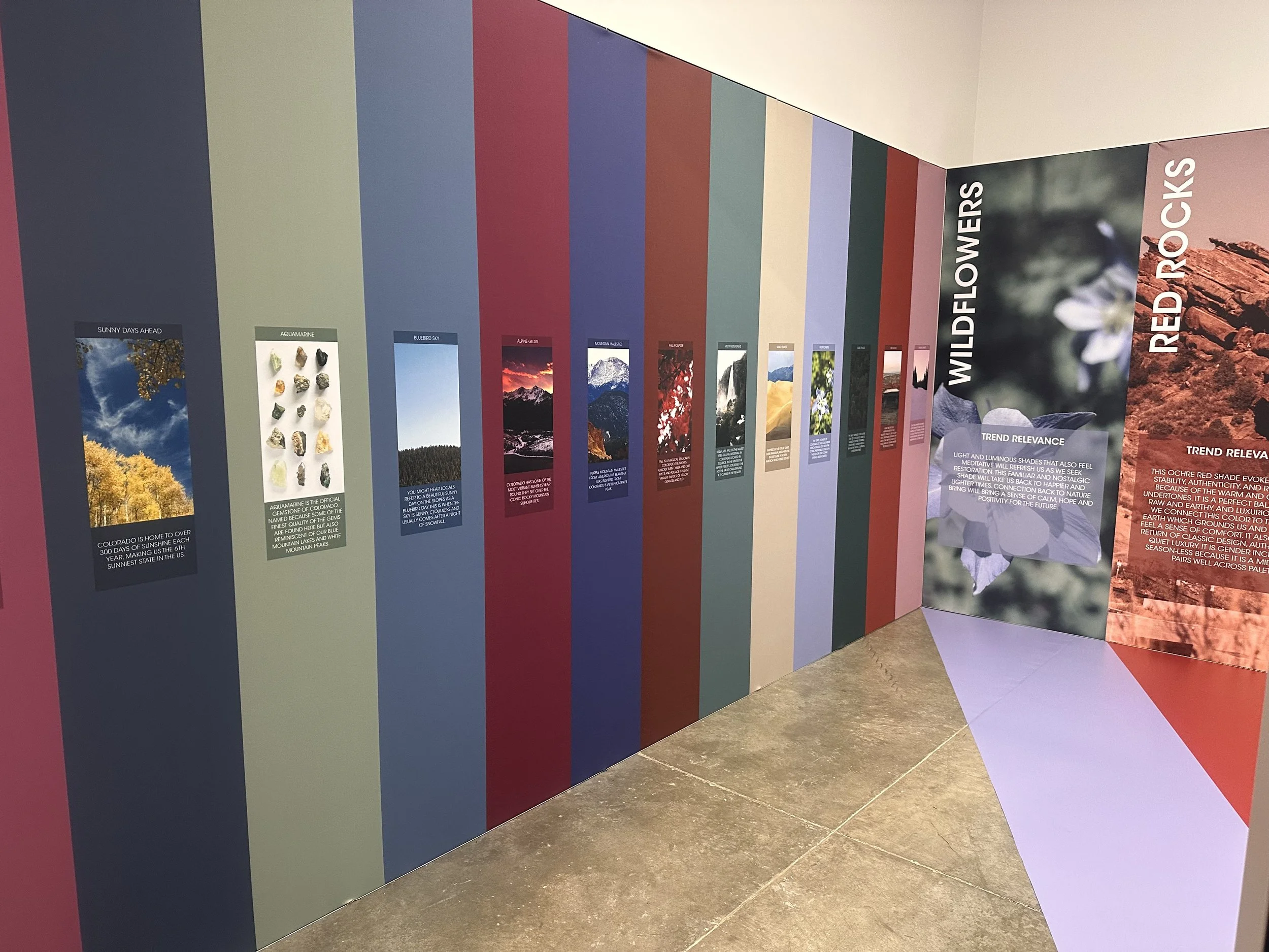
Color Palette
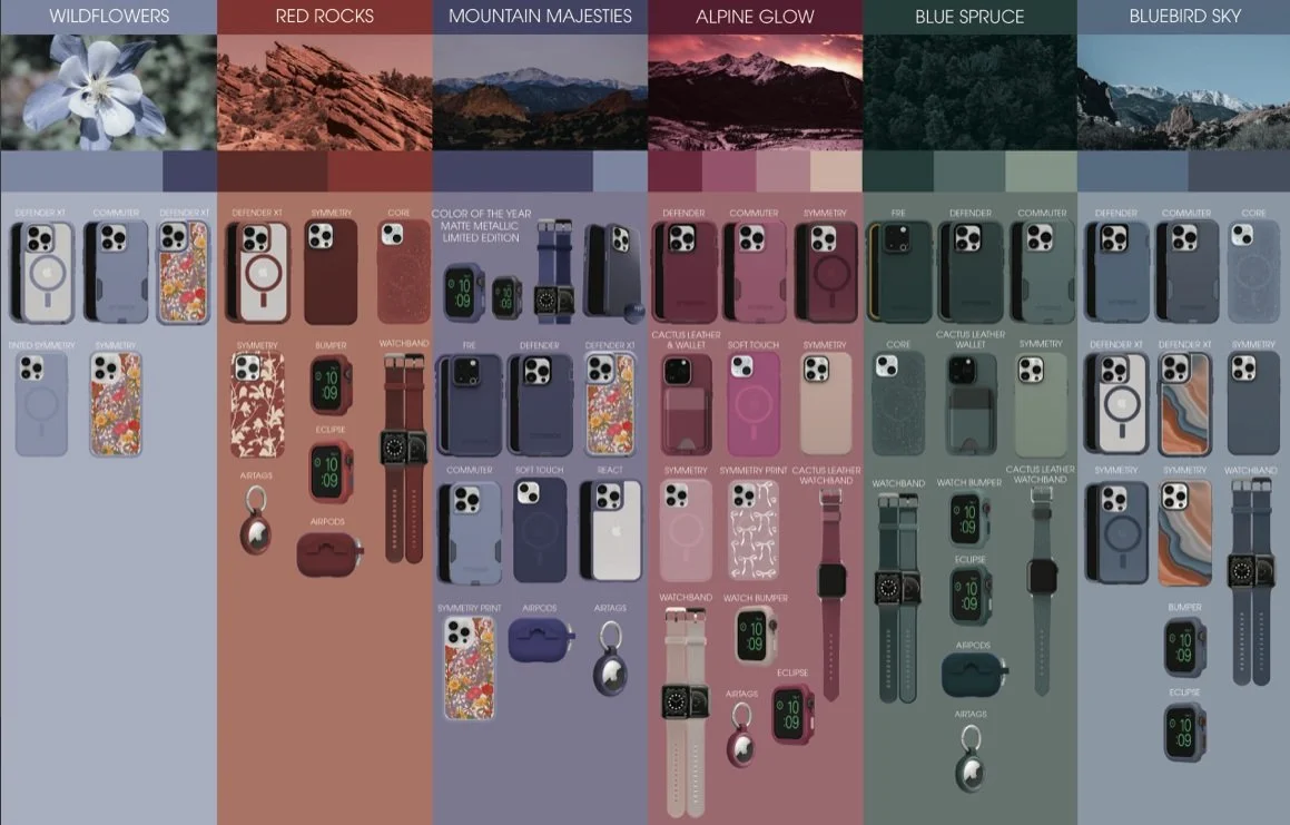
Color Collections
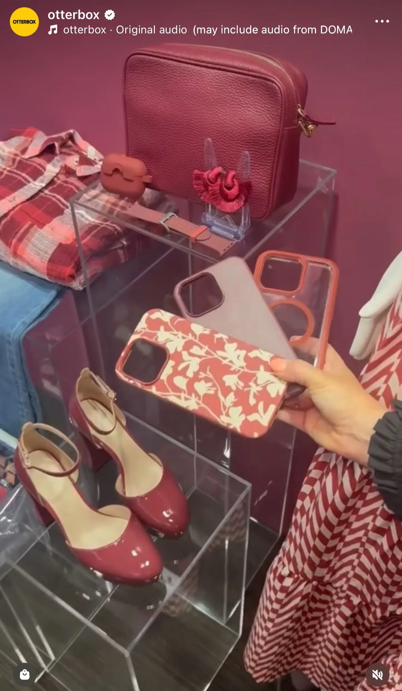
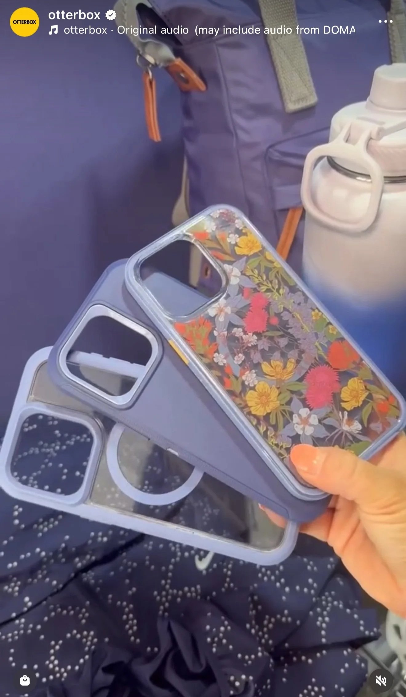
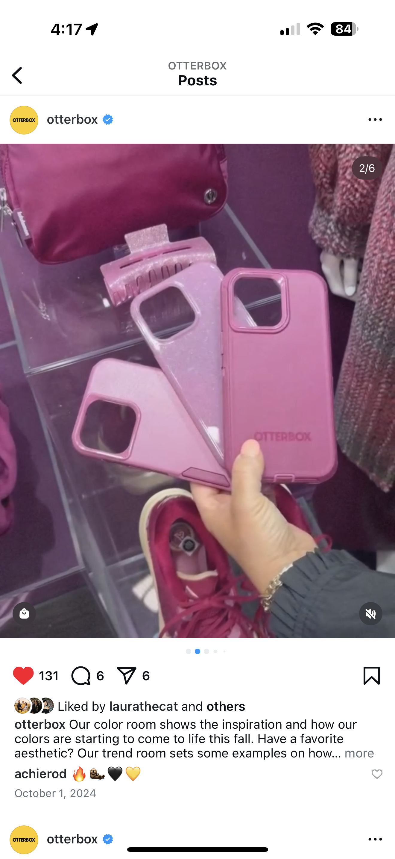
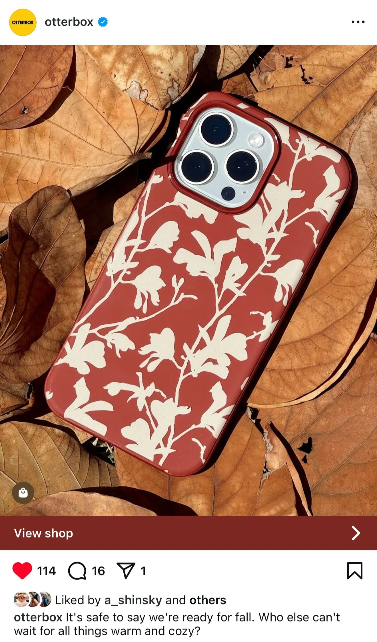
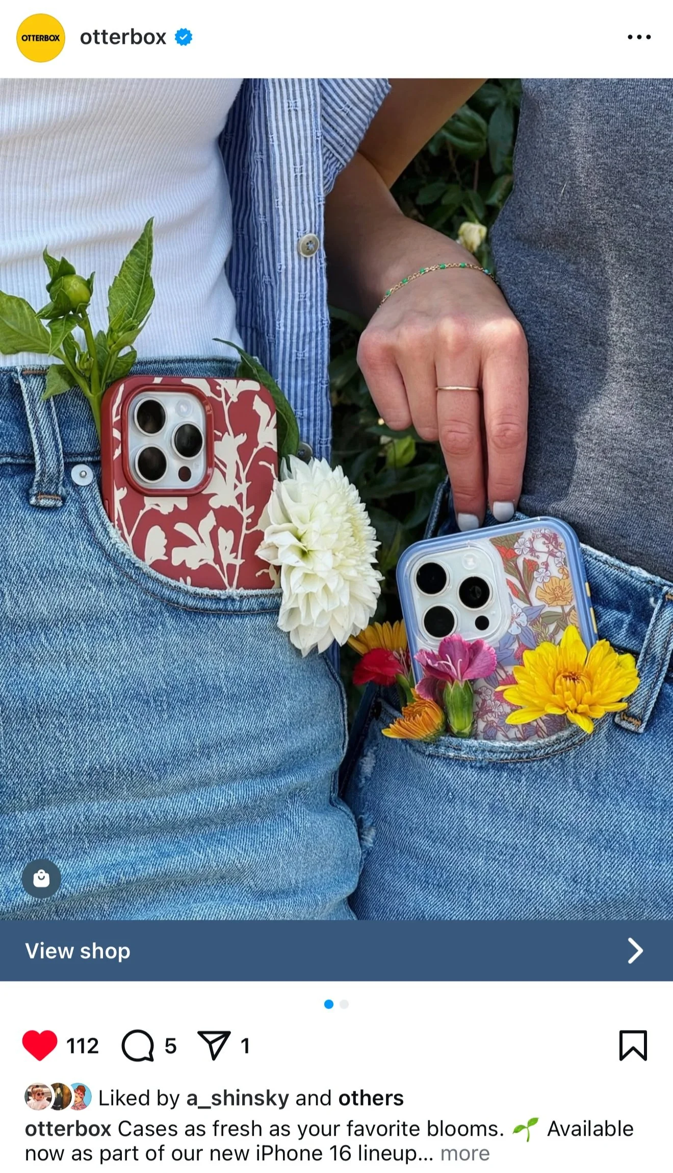
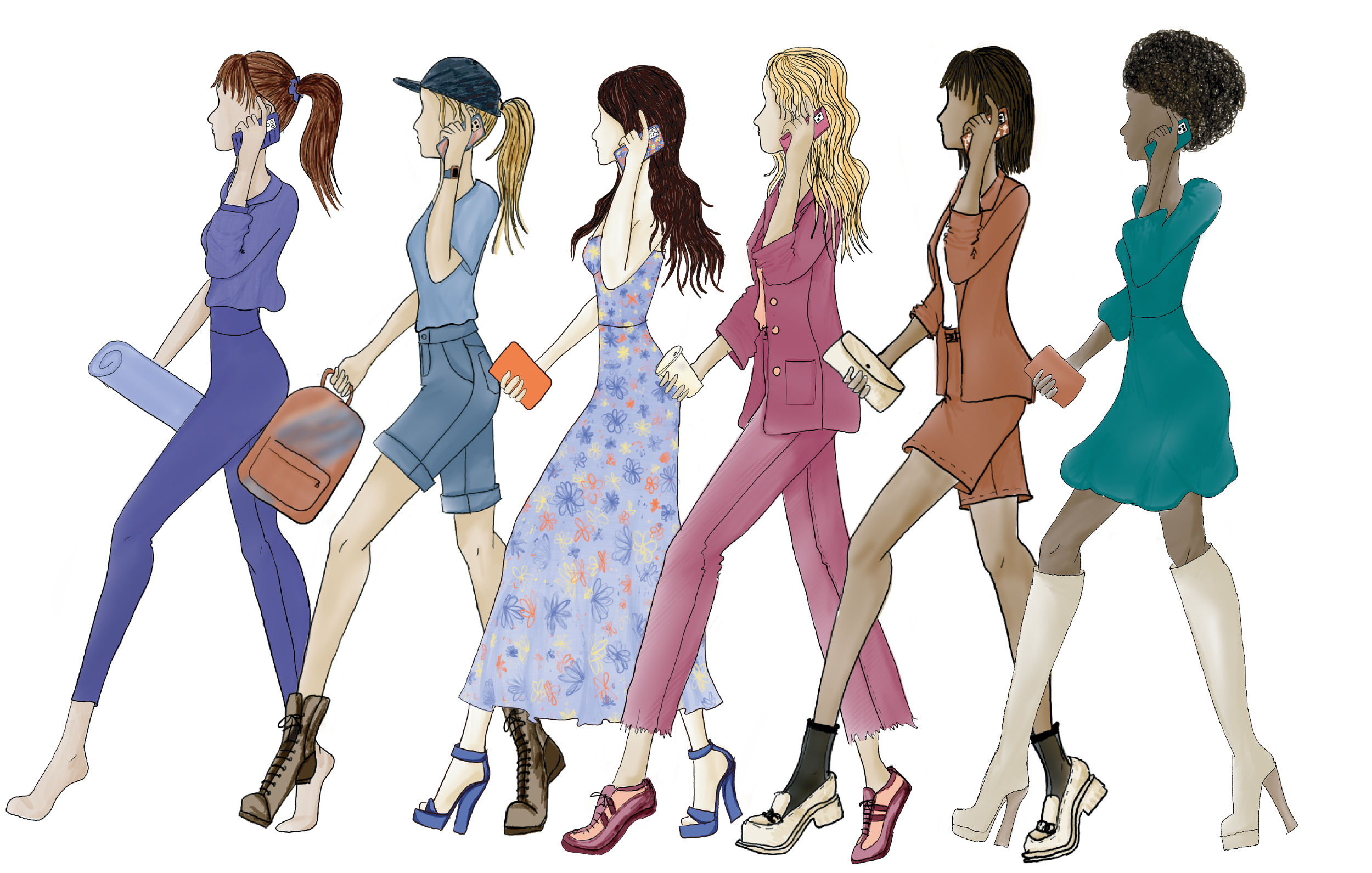
2025 is the first year that a single palette was used across all product lines. The reason for this was so a color story could be told to consumers and with OtterBox’s product offering felt like a full palette but offered collections within. From consumer research, people preferred when they could buy multiple products that coordinated together so they can make a statement with their tech aligning to their personal style.
While creating the annual palette, I carefully curated colorways that worked within their color collection but also had enough versatility to mix into other color collections without clashing. This was tied together through color accents, prints, and consideration how each color worked together and on its own.
Color Confirmations
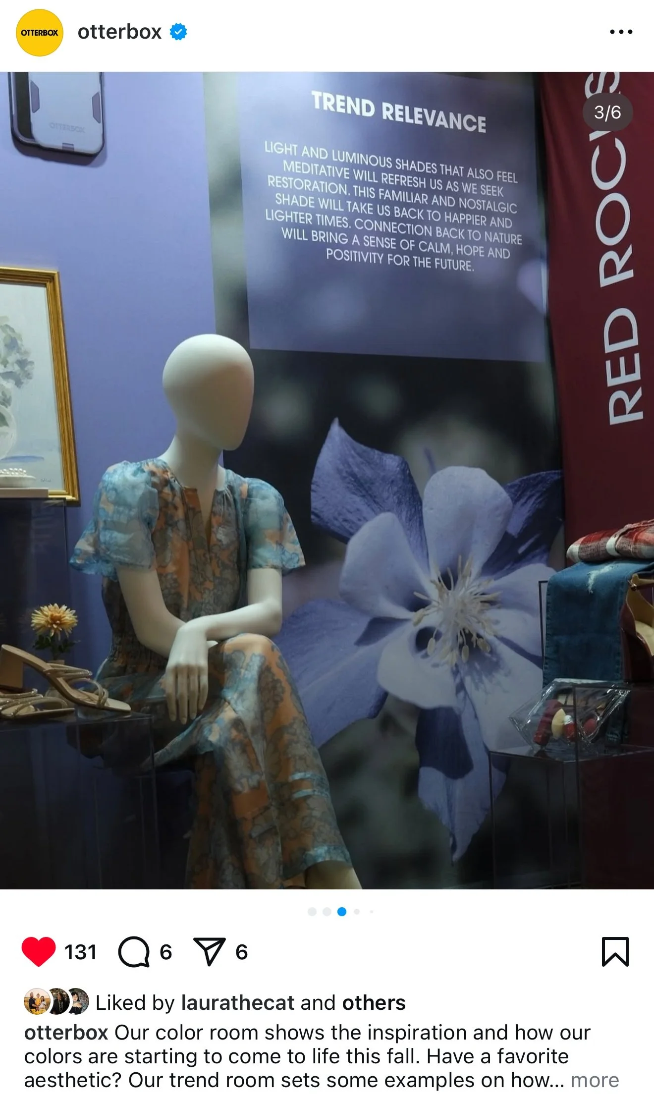
Every year I create color confirmation visuals as a tool for sell in with different buyers. Since the color palette was being shown and picked up over a year out, these visuals would help show context to the trend. I would show where the trend typically would start for accessories through luxury and runway to how it starts to trickle down to more mass market and mainstream brands and retail.
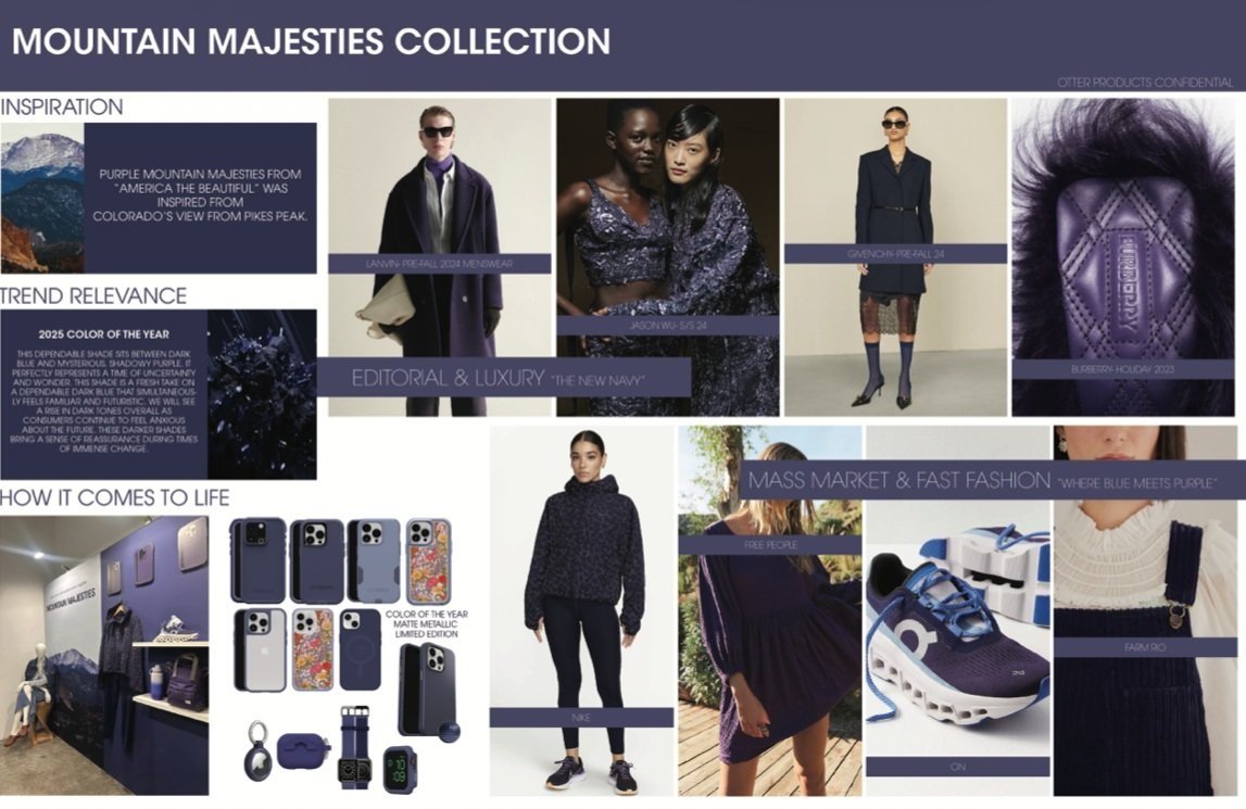
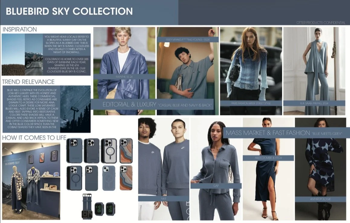
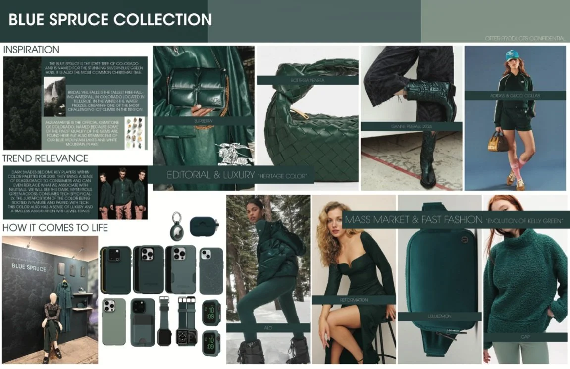
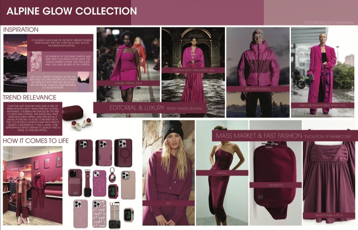
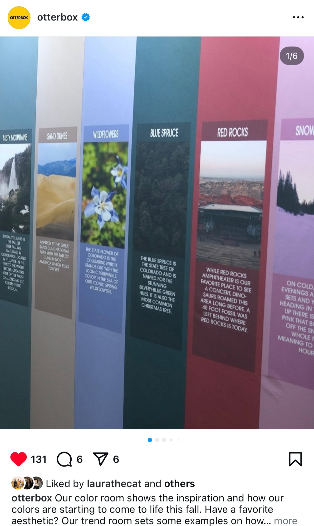
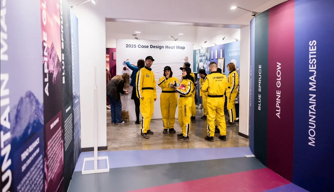
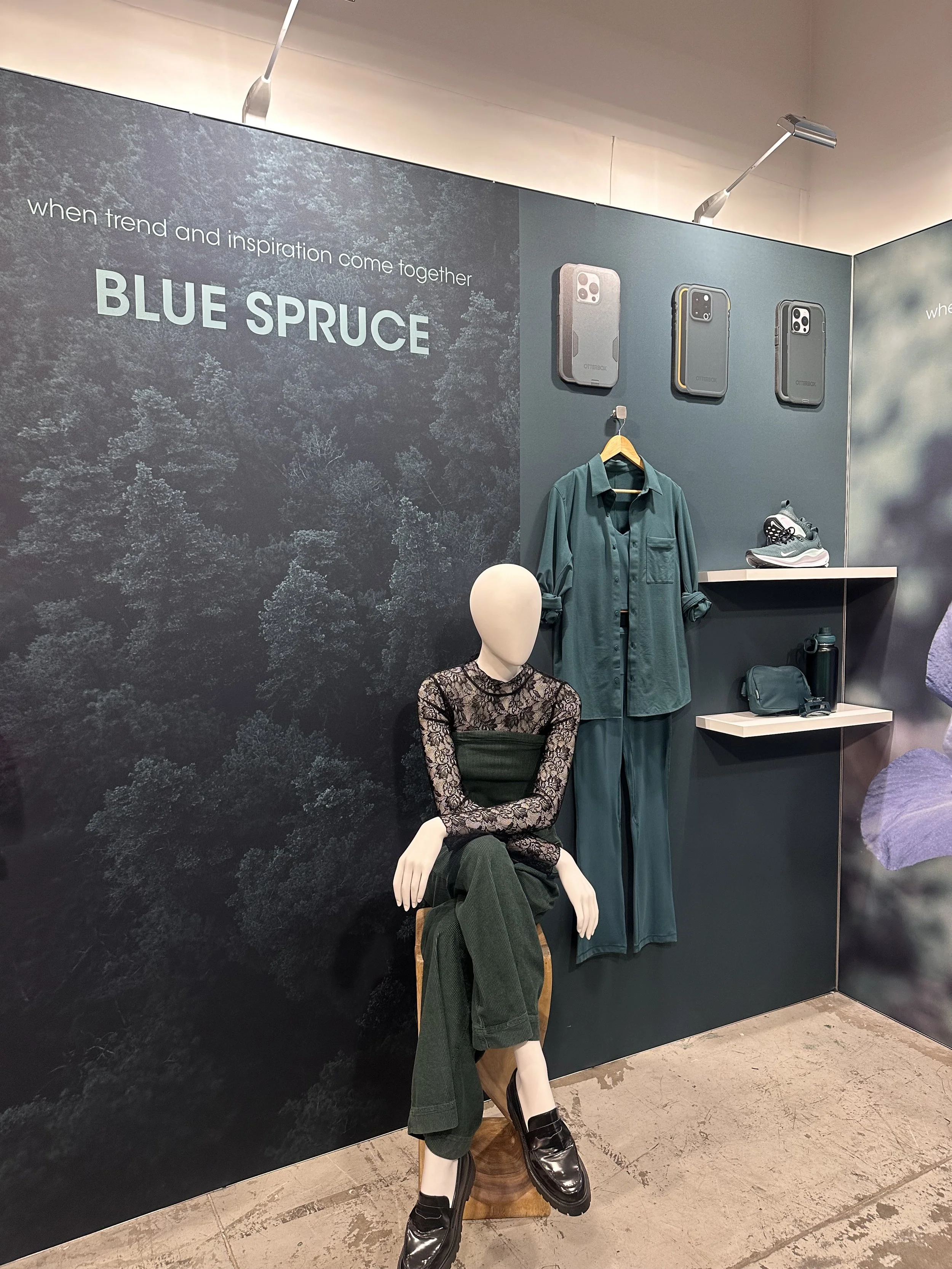
CES: Trend and Color Experience
CES (consumer electronic show) takes place every January in Las Vegas to show off the newest technology trends and a peek into what is to come for the future in the space. January 2024 we revealed our 2025 trend story and color palette. This color palette launches in the fall to align with one of the biggest device launches each year.
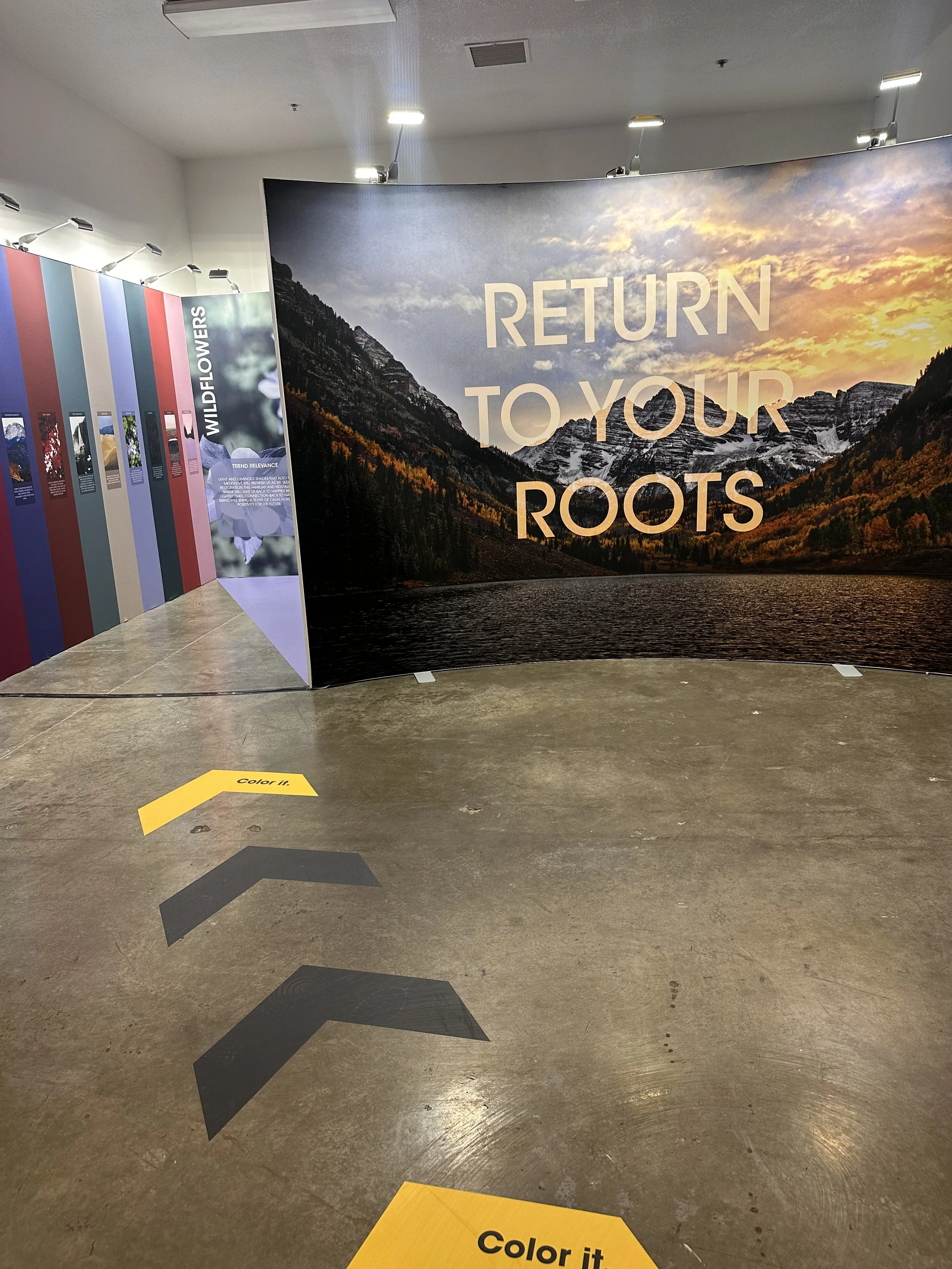
This event was held at an off-site venue and it allowed OtterBox’s customers a walk through of our brand, all the testing that we do, what was to come from our product teams, and a color experience. This space walked through the process I go through each year in a visual story telling way.
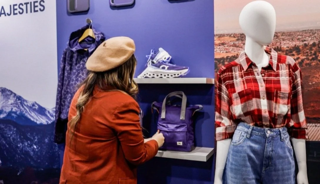
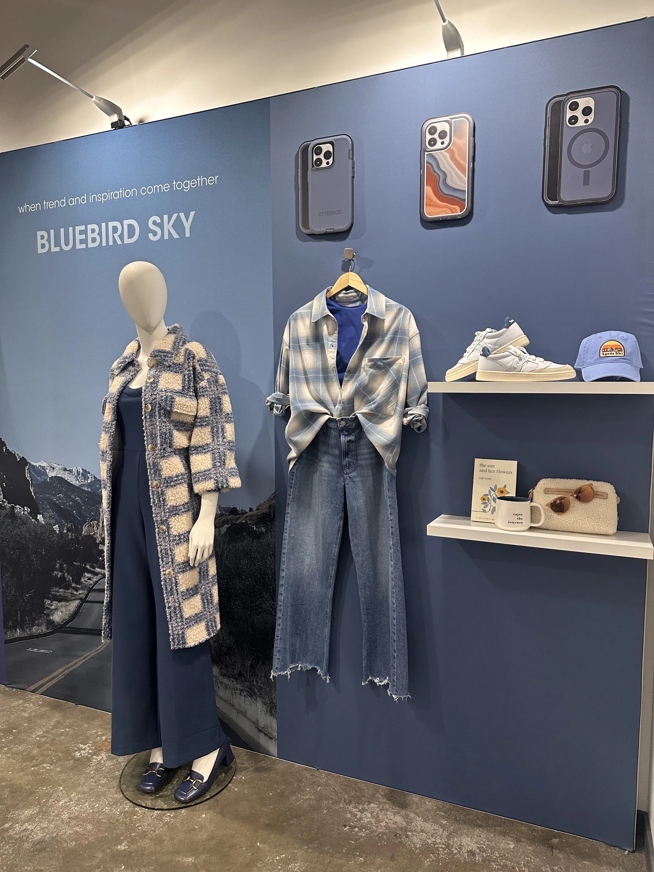
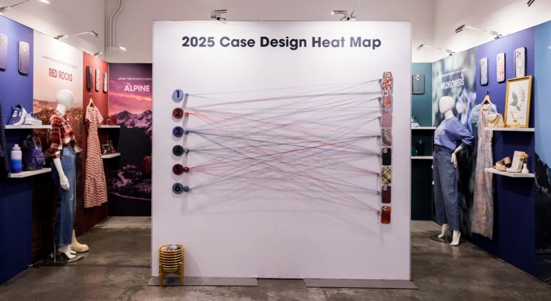
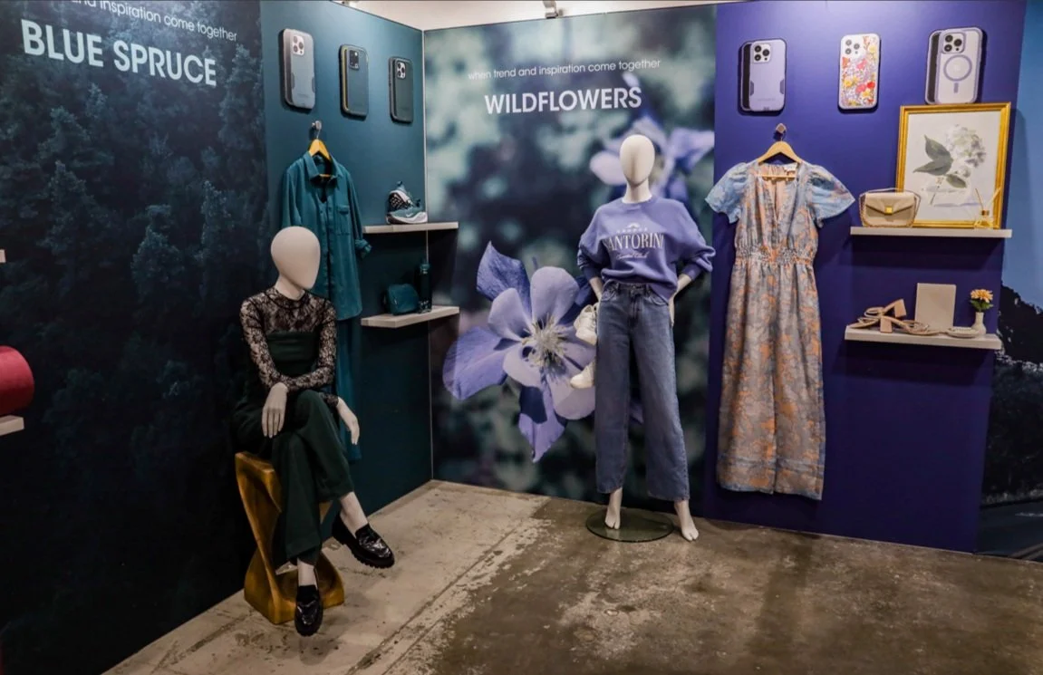
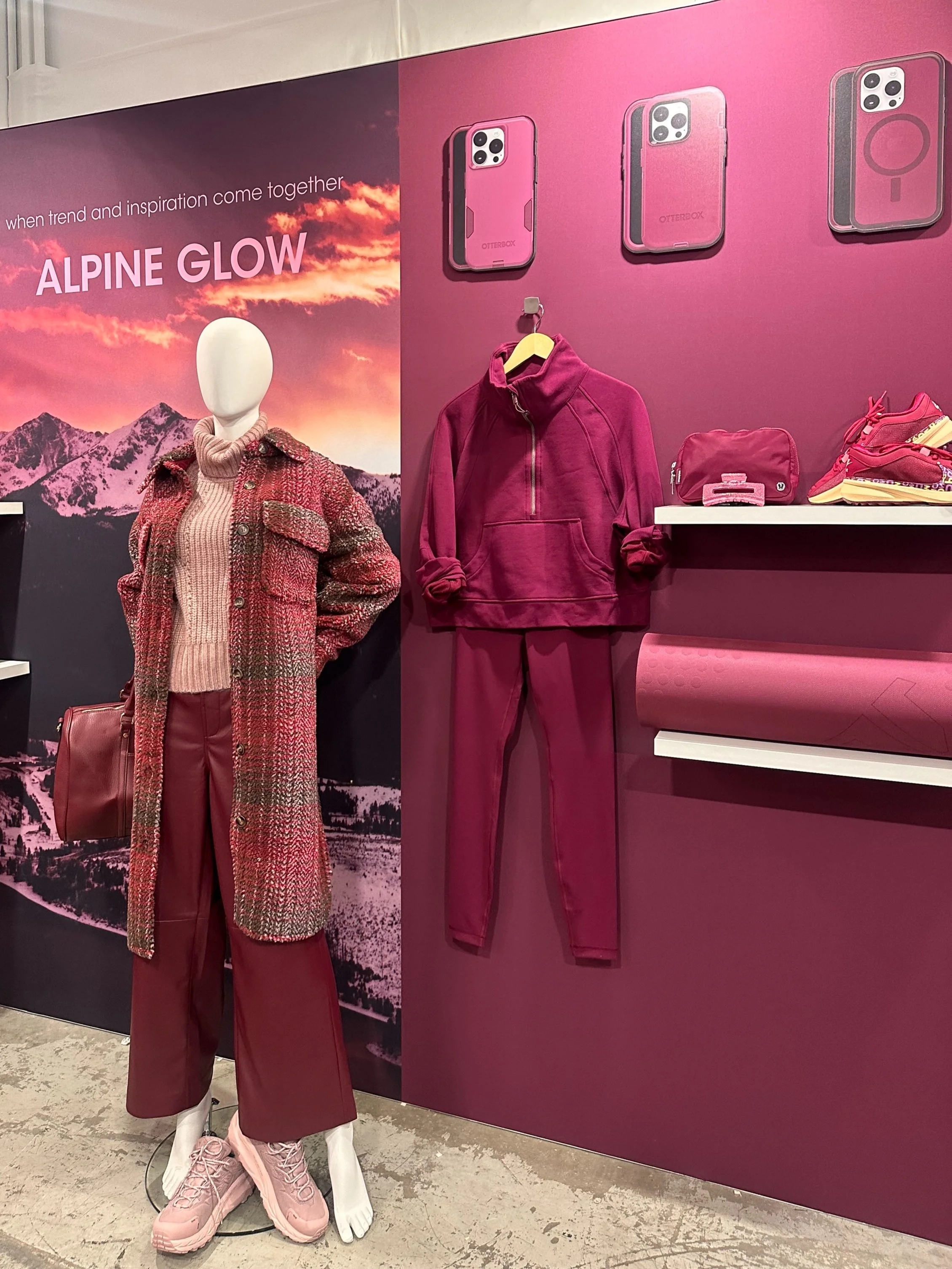
As you walked into the space, I was there to explain the research that lead to the trend story. As you continued through the space, I layered in the inspiration to the color palette, and how color collections come together and the color research that I did to get to those collections. As you entered the second room, it really came to life. The space was hidden so it was a visual surprise as you turned the corner. As you walked in, there was an interactive wall to pick next seasons prints. We used this information to help decide what prints went into production. Around the room was each color collection with clothing that consumer might purchase as well as accessories and home decor. This is to bring OtterBox’s consumer segmentation to life while showing the relevancy of these color collections for the upcoming year.
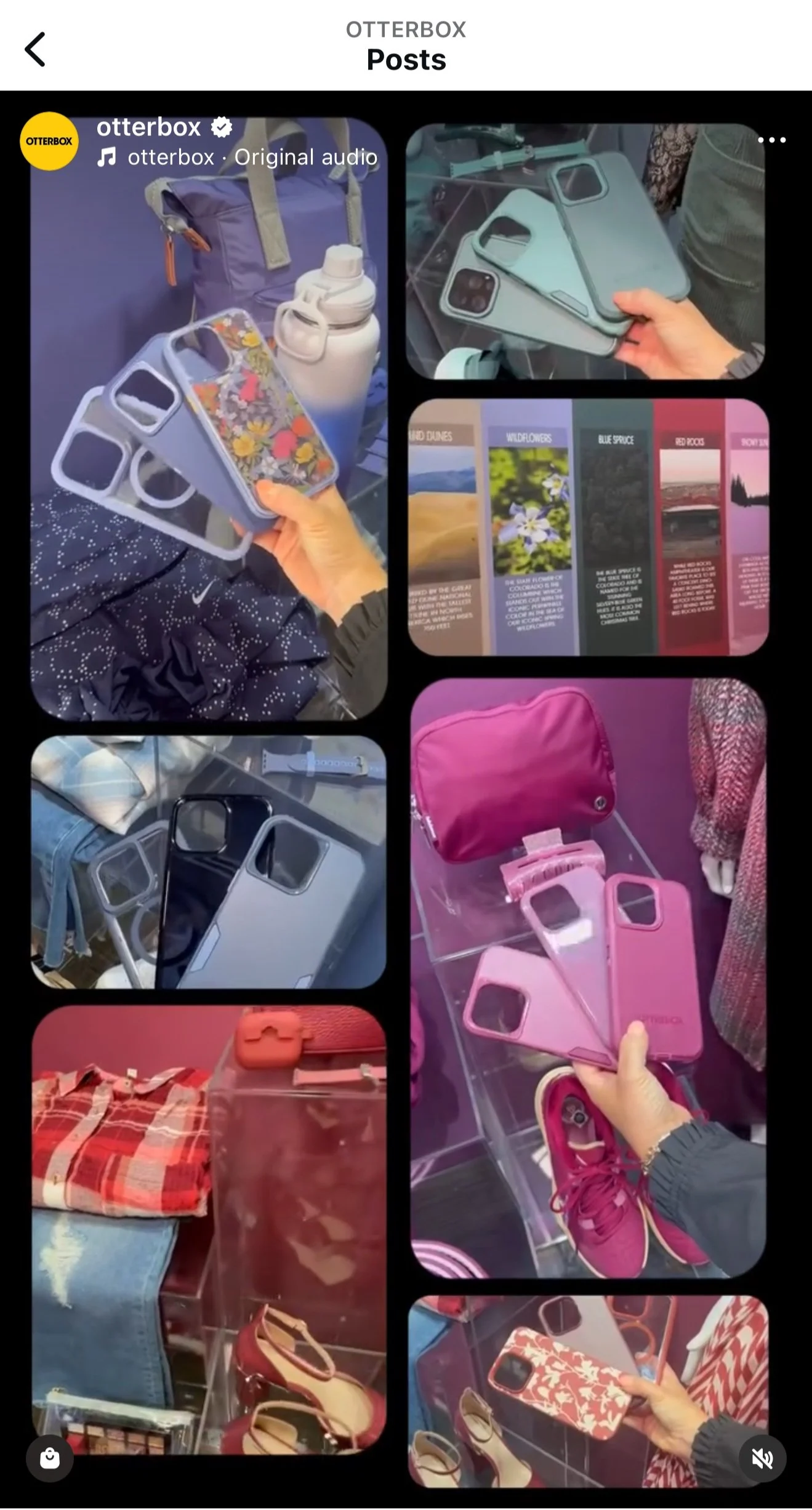
As launch got closer for this new color palette and collections, I worked closely with OtterBox’s social media team with bringing this to life to our consumers. We wanted to bring OtterBox’s consumers along the journey of our color process so they could find the perfect color and accessories that align with their personal style.